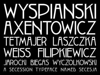
 “What makes it so beautiful,” Brendan Ciecko says, “is how abnormal the D and the B are. And the A, with a high cross bar.”
He’s showing me a collection of fonts he’s created based on Polish posters and documents that date from 1908 to 1939.
This font – Secesja (Secession) – is based on a poster from 1908.
“You rarely see N’s like that,” he continues.
The lettering on the posters and documents was all hand-painted or hand-drawn. To make an entire alphabet, he’s recreated each letter form – taking out a bit of the human error that would naturally take place – and then worked through the kerning. That’s the space between each letter, which is different when, for example, an S is placed next to a K versus an A.
“I put weeks and weeks of work into an individual typeface,” he says. That’s evident in the detail on each individual letter, in the curves on the N, S, B; in the elongated profiles of the G and P; in the simplicity of the J.
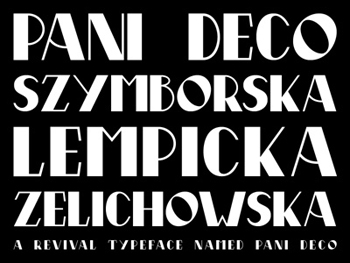 Pani Deco (Ms. Deco) is based on a poster by Polish artist Anna Harland-Zajączkowska.
“The cool thing about this,” he says, is that the poster was designed by a woman (hence Pani, which in Polish translates to Ms. or Mrs. Deco) in an era when there were so few female designers worldwide.
The typography on the poster has an exaggerated thick-to-thin ratio, and that’s what Brendan’s recreated in this typeface: the middle of the N, for example, is very thick while the sides are super slim.
“I wanted people to instantly recognize: Oh, that’s a Deco sensibility,” he says.
Brendan’s fiancée is Polish; she and her parents emigrated from Poland in the late 1980s. She and Brendan are both passionate about Polish history, culture and art, and spent considerable time in Poland, living in both Warsaw and Kraków.
“I did tons of research in the evenings and on the weekends,” he says. “I would see something as I would walk down the street and be like, well, what’s the story behind [Warsaw’s] Foksal Street?”
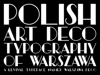 Warszawa Deco (Warsaw Deco) is based on a document he found from 1939, with no known artist.
With this font, he wanted to capture the essence of Warsaw’s modernism.
“There’s a really incredible Warsaw from 1920 to 1939,” he says, in terms of aesthetics and energy – in art, design, theatre, film – and against the soundtrack of baritone Mieczysław Fogg and the very popular Polish tangos (Polskie Tanga).
Warszawa Deco has a very thick weight: “It goes from extremely heavy weighting on one side to very thin curvature. That’s a very common trait of Art Deco typography.”
This type of lettering was often found on the sides of buildings, or in old Polish films.
“When you look at old images of Warsaw before the war,” he says, “it’s one of the most beautiful cities in Europe. I feel like very few people understand how beautiful it was, because the images aren’t as accessible, or as public.” Today, of course, much of that Warsaw no longer exists, since more than 80% of the city was bombed during World War II.
Brendan’s visited numerous Polish cities: besides Warsaw, Kraków and Gdańsk, he’s traveled to Cieszyn, Bielsko-Biała, Malborg, Sopot, Gdynia, Pieskowa Skała.
“I’d love to hit every single Polish city,” he says. “The background on my computer is Łódź.”
He’s also traveled to cities that were once Polish – including Lwów (today Lviv, Ukraine).
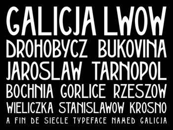 His Galicia font is based on a poster printed in 1911 by the Piller-Neumann print shop. The artist is unknown.
“You can get the sense that it’s more eastern Poland,” he says. “There’s some nuances that you see throughout Ukrainian and Russian Cyrillic.”
Spending so much time on the fonts meant that at a certain point, he began sensing the way the letters should curve and where: The N, for example, has an abrupt curve very near its top.
“The A and B are very eccentric,” he says. “The Y looks a little bit more like a Cyrillic character.”
Brendan’s been researching his own ancestry, which goes back to the eastern Galicia region.
The 1911 poster that inspired this typeface advertises a market of Polish products: “Jarmark Wyrobów Krajowych.”
The materials he uses as inspiration don’t ever include the entire range of letters needed for a full character set. He designs the missing letters based on ones that do exist.
He’s even designed a font off a book title with just eight or nine letters. First he cleaned up, retraced and standardized the letters that existed, then created the remaining letters based on the style cues of the base letters and era.
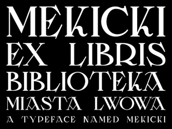 The last font he shares with me is Mekicki, named for Rudolf Mękicki, artist of a 1928 poster titled: Katalog Wystawy Książki Lwowskiej (Catalog of Lwów Literature Exhibit).
The font is classically fluid and more like a traditional 18th century typeface with lots of angles. “The A is so cool,” he says.
He named the font Mekicki, because although there isn’t much information available about the artist himself, Brendan is convinced that Mękicki designed both the poster and the typography because of how type-centric the imagery is.
All the fonts he’s created are capital letters. The typefaces aren’t necessarily for typing out an entire document, but rather for highlighting titles, mastheads and the like.
He hasn’t released any of the font files to the public yet. He has some ideas on how he’d like to do so, and is thinking of partnering with a Polish or Polish-American institute or organization to interact with those communities and people who are interested in Polish art.
He says it’s important for people to know about the Młoda Polska movement and Polish art typography, pre-war.
“You’d think that there’d be a page or blurb in art history books that you’re getting here in the States, that there’d be some kind of consideration for these artists from other countries,” he says. “People know Gustav Klimt, but they don’t know Stanisław Wyspiański.” CR
VIEW
Brendan’s work online on his Dribble page.
Imagery
All imagery courtesy of Brendan Ciecko


Sweet!
Great article! I’m glad you put this in the spotlight. This kind of history is so important